A strong brand, buried in its own website.

Shane Baker Studios' website needed some serious attention after years of "good enough".

We stepped in to reorganize and redesign while pairing it with a customized backend to supercharge Shane and allow his team to manage it themselves. On top of that, their site performance scores shot up as well.

Now it's easier than ever for clients to find his site and book their dream shoot.

Client
Shane Baker Studios, an artist and photographer in downtown Mesa, Arizona
What we did
Comprenhsive site audit, full rebuild, brand refresh, and custom app development
Result
Two websites and 31 separate pages became one site, live November 7, 2026 after 5 weeks of work
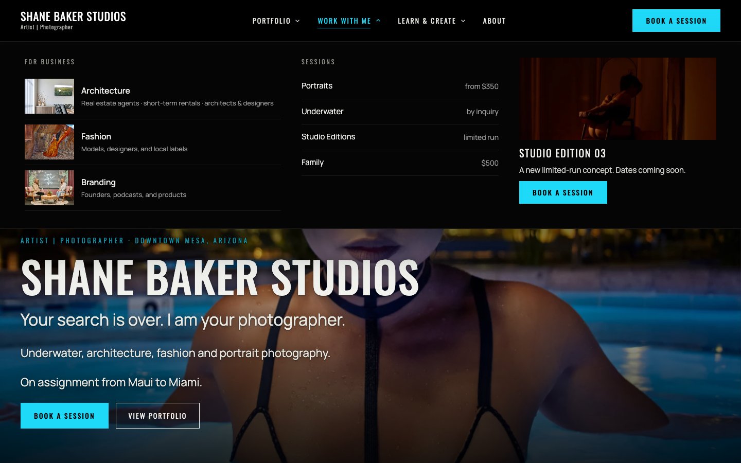
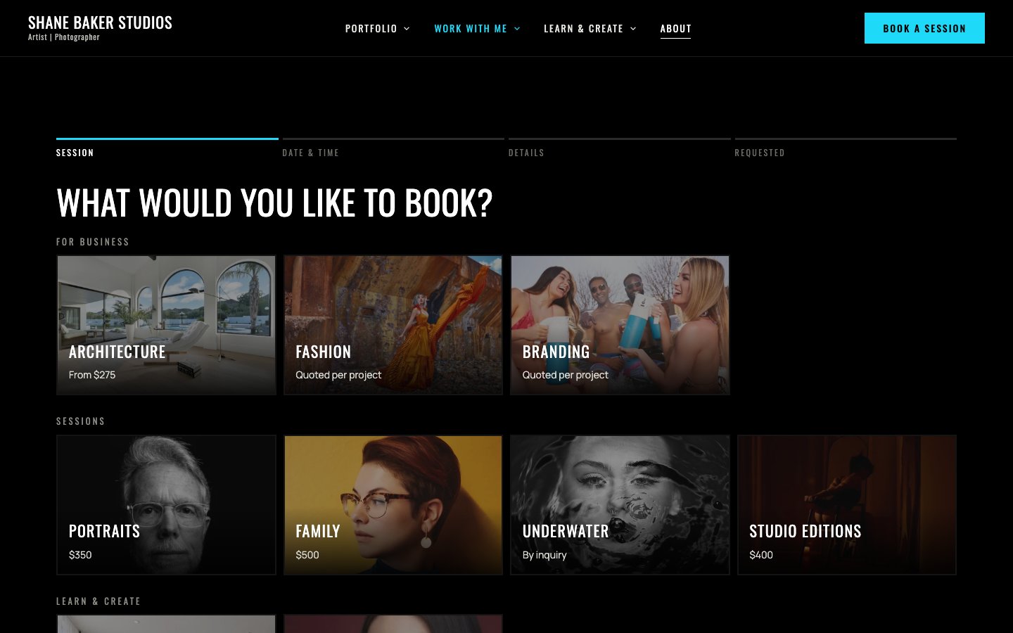
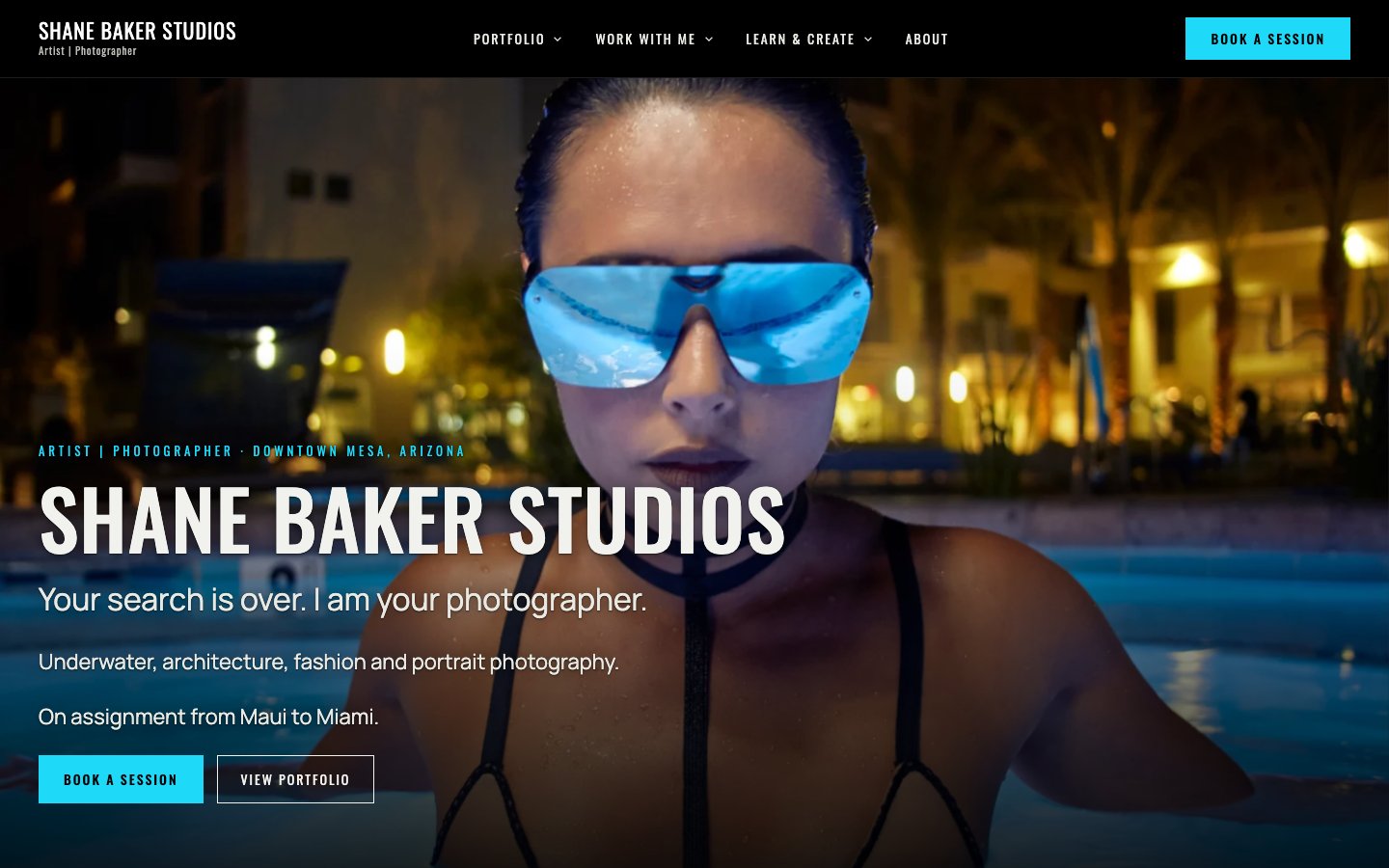
The Shane Baker Studios home page today, with Book a Session and View Portfolio
shanebakerstudios.com
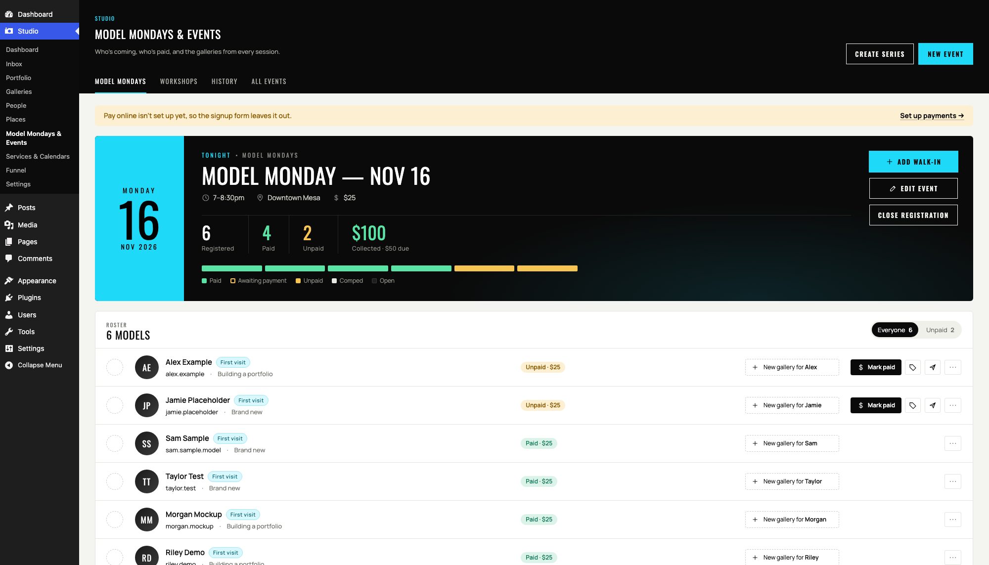
The Model Mondays planner in the Studio admin, showing the roster with sample names
the Studio admin

Allow me to share with you one of my favorite things: building tools to help local businesses do business better

To whoever is reading this,

If you ever get a chance to talk to Shane about why he's in photography instead of some other industry, you'll see his eyes sparkle. Photography is truly a passion for this man, and in every photograph he takes he endeavors to tell a story with it. I am not a photographer (no surprises there), so please allow me to share with you the story of how we helped a local creative and business owner flourish through my own medium of choice: a humble web page.

Whether or not your business is as focused on the arts as Shane Baker Studios is, I'm sure there are creative and beautiful parts to your business too. A large part of what helps me to unwind after a long day of work is appreciating beautiful works of art... whether that's music that takes me away for a moment, an engaging work of fiction that pulls me in, or yes: even a beautiful photograph that catches the breath and fills me with wonder.

But good art is found not only in the "classical" sense, you know? Not everyone considers website building an artform (and certainly not the careful application of custom web app/web tool building), but I do. I bet there's something like that about your business too. So as you read along about how we helped Shane's business, I invite you to imagine yours too... even if it's the kind of art not many get to appreciate, such as the careful laying of plumbing behind drywall or the satisfying quietness of a freshly-installed garage door motor.

Sometimes when you're too close to your own brand, it can be difficult to know how to organize it and present it. Perhaps you can relate? I know I certainly do. Shane is an amazing marketer, so being able to support him in this way was truly an honor for us here at Magnolia. Because we were able to approach his brand with fresh eyes, we were able to reorganize it in a way that would engage those new to the brand... no small feat considering how broad and varied the work that Shane produces there is! Beyond that, we also make sure we understood his workflow and how he worked so that he could focus on his art, craft, and content and continue to relentlessly pursue his dream of becoming a "capital-A Artist".

If this sounds similar to a challenge you're facing, please reach out and schedule some time with me. The "book now" buttons on Magnolia go directly to me, and I promise to bring the same level of dedication and care to your site as we were able to do for Shane's.

All my best,

Malak JanusMagnolia Development

The problem

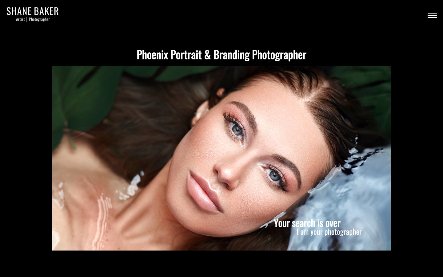
Shane Baker’s photographs already had a look: black backgrounds, bold condensed all upper-case type, a bright blue accent. Gallery pages of images-only, presumably to allow the work to stand on its own. But all of this flatness made it hard to know what to do or where to go... if there was even a call to action available at all.

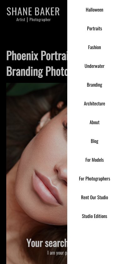
The menu was a single hamburger icon, even on desktop... and they were organized as a flat list with no organization or hierarchy. Galleries, event sign-ups, and a second architecture website all sat next to each other looking the exact same. On top of that, we discovered about a dozen live pages that weren’t linked from anywhere on the website. To make it even more confusing, the architecture link in the navigation actually brought you to a separate but very similar-looking site with the same logo, so visitors wouldn't have any idea that they'd left the original site and end up confused where the rest of the content went.

And then there was booking. From the visitor's perspective, booking was the hardest part. Depending on the page, “book” meant a Wave invoice, Bloom, Square, a separate subdomain, a form, Venmo, or texting Shane for a date. Not only is this unpolished from a professional perspective, but it also put a lot of administrative burden on Shane himself to ensure all of his records were up-to-date and organized.

What we did

Counted everything first. We did a full audit of both sites: every page, every menu link, every button label, every place a visitor could pay. Before approaching anything, we always take full inventory of what we're working with. In this case, it was 31 pages, 2 sites, and 7 ways to pay.

One site, organized around what people come for. To prevent splitting his domain authority, we decided to fully move the old architecture site home under Portfolio. Everything Shane offers now sits under the menu it belongs to: Portfolio, Work With Me, Learn & Create, and About. Because of the breadth of work and services offered, we made sure that the navigation was a part of the user journey and experience as well.

One way to book. Every Book a Session button opens the same flow: pick a session, choose a date, pay the deposit, get a confirmation. Payments run through the single payments platform that Shane Baker Studios uses: Wave... with one exception: Model Mondays. That event still takes Venmo and Zelle, simply because that’s what the models prefer. Your tools, platforms, and solutions should bend to the needs of your users, and not the other way around.

Old links still work. 301 redirects send every old URL, including the whole architecture site, to its new home, so links Shane has shared over the years don’t break.

A block library with the decisions built in. Shane's old website was built in WordPress, and his new one is too because that's what he's familiar with. However instead of paying for a subscription builder, he now has new WordPress-native blocks and orchestrated page templates with the brand’s choices already baked-in: one blue, one set of fonts, and mobile-responsive layouts that work on a phone and with a screen reader. Shane picks a block and adds his content; he doesn’t pick colors or check breakpoints.

Shane wanted to focus on his art, not his web forms.

With multiple ways in, Shane was drowning in messages and requests. By bringing them all in together, we've been able to simplify his workflow while also providing a more polished and professional appearance for his work. Shane Baker Studios also runs their invoicing and payments run through Wave, so we made sure to provide an integration for that too.

But every business is a different, and in our initial discovery and planning period we learned from him and his website users though that invoicing for Model Mondays is a little different. The models showing up for digitals still largely feel more comfortable with Venmo and Zelle as a payment platform instead of a website, so we kept that exception in. At the end of the day, what already works for your business should keep working for your business because no one knows Shane Baker Studios better than Shane Baker himself.

Seven old checkout paths become one booking flow Wave invoice, Bloom, Square, a vip subdomain, an on-page form and a text message all lead into Book a Session, which has four steps: pick a session, choose a date, pay the deposit, get a confirmation. Zelle or Venmo stays as a separate branch for Model Mondays and joins at the deposit step. Wave invoice Bloom Square A vip subdomain An on-page form A text message Zelle or Venmo Book a Session Model Mondays keep Venmo and Zelle because that's what works best for this customer segment 1 Pick a session 2 Choose a date 3 Pay the deposit 4 Get a confirmation

Seven old checkout paths

  • Wave invoice
  • Bloom
  • Square
  • A vip subdomain
  • An on-page form
  • A text message

Book a Session

  1. Pick a session
  2. Choose a date
  3. Zelle or Venmo Model Mondays keep Venmo and Zelle because that's what works best for this customer segment.

    Pay the deposit
  4. Get a confirmation

Then and now

We made several new layouts to help the artwork stand on its own and allow Shane to tell not just the story of the clients they've shot with, but also the story of Shane Baker Studios itself.

Here're some of the highlights of the before and after that we were able to craft for him.

Three pages, before and after

Scroll through the home page, the menu, and booking as we found them and as they are now. The plum notes are what we noticed... the green ones are what we changed.

Home page

The old home page: one image, no button, nothing below it
Before
The home page today, with Book a Session and View Portfolio
Today

What was wrong

  1. One image, no button or call to action.

    Even the most engaging and converting page will fail if there's no button for them to take the next step.

  2. Nothing below it.

    A visitor who isn't sure yet has nothing more to read, so bounce.

What changed

  1. Every page gets a call to action.

    Book A Session as the next step is always in view so a visitor can always convert.

  2. View Portfolio beside it.

    A visitor who is not ready to book can keep looking until they are.

Menu

The old menu open: eleven links in one list
Before
The Work With Me menu open, showing sessions and prices
Today

What was wrong

  1. Navigation hidden from view, even on desktop.

    A visitor on a desktop sees no menu at all, so most pages never get a look.

  2. Eleven links in one flat list.

    When everything is important, nothing is important. The visual experience itself also doesn't match the storytelling aesthetic that's important to Shane Baker Studios' brand.

  3. Galleries, sign-ups, and a second website look the same.

    Visitors struggle to understand which are galleries, which are informational, which are bookings, and where to get help.

What changed

  1. Four menus: Portfolio, Work With Me, Learn & Create, About.

    Each page sits under the menu it belongs to, giving visitors a clear path to the content they want to engage with while gently educating them on the breadth of services available.

  2. Engaging media-rich navigation tiles.

    Like the tour manual at a museum, all of the exhibits are listed tucked away until they're needed to spark the visitor's curiosity.

  3. Book a Session in the header.

    A consistent and easy-to-find call to action that persists through every page so a visitor doesn't need to hunt for it.

Booking

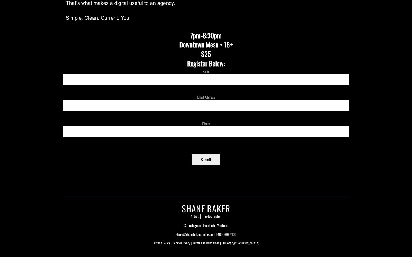
The old For Models sign-up, a plain form
Before
Step one of the /book flow
Today

What was wrong

  1. A plain form and not much else.

    This form does little to reassure the user that they're making the best choice when booking with Shane Baker Studios. Even the main button isn't colored to match the call to action blue.

  2. Other pages used Wave, Bloom, Square, or a vip subdomain.

    Every page booked a little differently, so each one felt a little like a different business... or worse: a business that couldn't be trusted with its users data and information because they couldn't even get their intake straight.

  3. Or a text, or Venmo and Zelle.

    Some visitors had to ask before they could even pay... and every one of those messages was something Shane had to keep track of by hand.

What changed

  1. One checkout, with deposits through Wave.

    Every Book a Session button now opens the same flow, and every payment lands in the platform Shane Baker Studios already uses.

  2. Four steps, start to finish.

    Pick a session, choose a date, pay the deposit, get a confirmation. Visitors always know where they are and what comes next, without leaving the branded experience Shane worked hard to establish.

  3. Model Mondays keep Venmo and Zelle.

    It's what the models prefer, so it of course stayed. What already works for your clients should keep working.

Malak did a complete redesign, and when she showed me the beta version I was floored. It was perfect. It fit my branding and honored the client journey.

Shane Baker
Shane Baker Studios

Behind the site

A good website isn't only what your visitors see, it's also how easy it is to maintain and the work it takes off your plate. Shane also runs the day-to-day side of the business from our studio plugin, an admin interface we built around the way he already works. Inquiries, bookings, galleries, calendars, and payments each have a home now... and they talk to each other so nothing gets lost in a text thread or a spreadsheet.

New tools for an existing business process

Having been in business for years now, Shane knew how to run his business best. Like many visionaries, he wasn't afraid of bringing together the tools he needed to support him in managing the administrative side of his business. During our discovery and planning phase, we asked a lot of questions and sat along with him while he did his most common management tasks. Afterwards, we were able to create a handful of tools that codified his processes so they were repeatable, reliable, and easy.

Dashboard

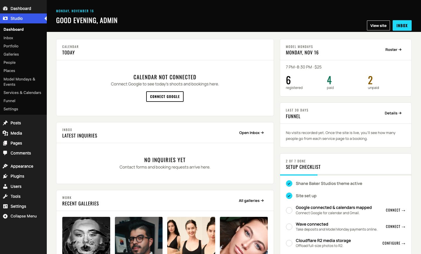
The Studio dashboard
  1. Today’s calendar, right up top, so Shane knows what his day looks like the moment he logs in.

  2. The latest inquiries, the Model Monday roster (registered, paid, and unpaid), the last 30 days of the booking funnel, and a setup checklist... all on one command dashboard screen.

Inbox

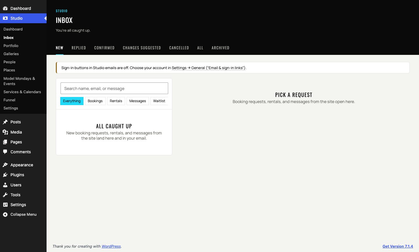
The Studio inbox
  1. Every contact form, booking request, rental request, and waitlist signup lands in one place, filtered by Bookings, Rentals, Messages, or Waitlist. No more hunting for who reached out where. (And he gets email notifications still, because that's what he likes.)

  2. The email thread sits right beside each request, so the whole conversation is in one spot.

Model Mondays

The Model Mondays planner roster, with sample names
  1. The roster with who's registered, paid, and unpaid at a glance... but with extra support for walk-ins because that happens too!

  2. Payment status for each person, whether it came through a Wave invoice, Venmo, or Zelle. A Collected total adds it all up so Shane doesn't have to.

Galleries

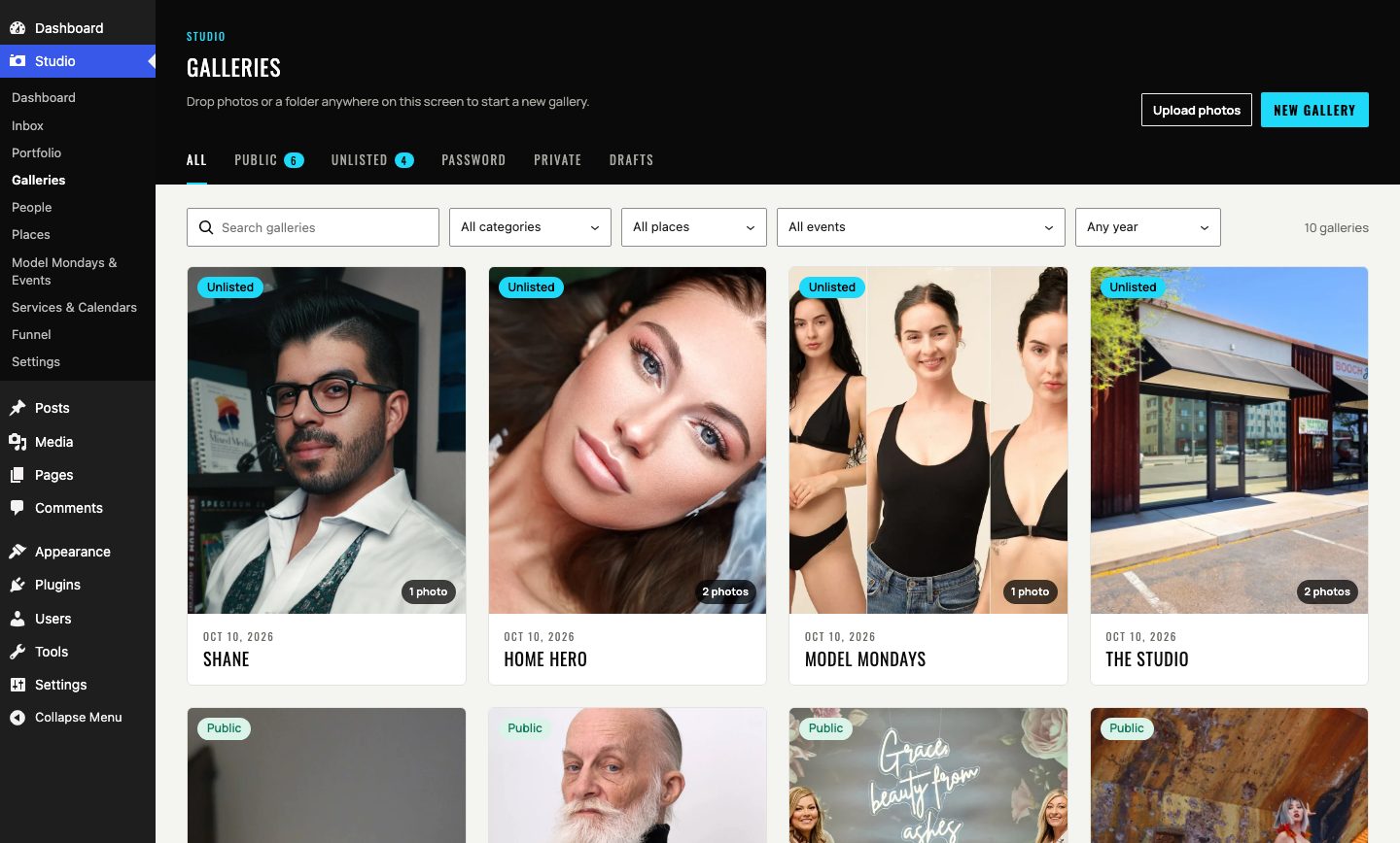
The Galleries page
  1. Drop photos or a whole folder anywhere on the page to start a gallery, then choose whether it's public, unlisted, password-protected, or private.

  2. Filter by category, place, event, and year. Every upload is converted to WebP and stripped of GPS location data on the server, so pages load fast and clients' locations stay private.

Calendars

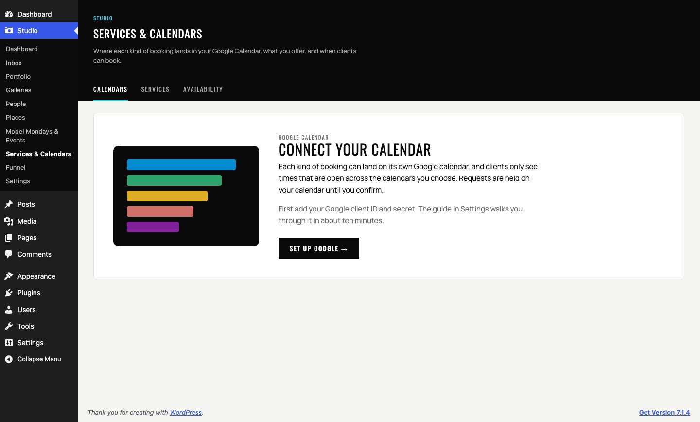
The Services and Calendars page
  1. Each kind of booking lands on its own Google Calendar, so a studio rental never gets mixed up with a portrait session.

  2. Services live here too, with their prices, deposits, durations, and add-ons all in one place, so Shane doesn't need to update information more than once.

Funnel

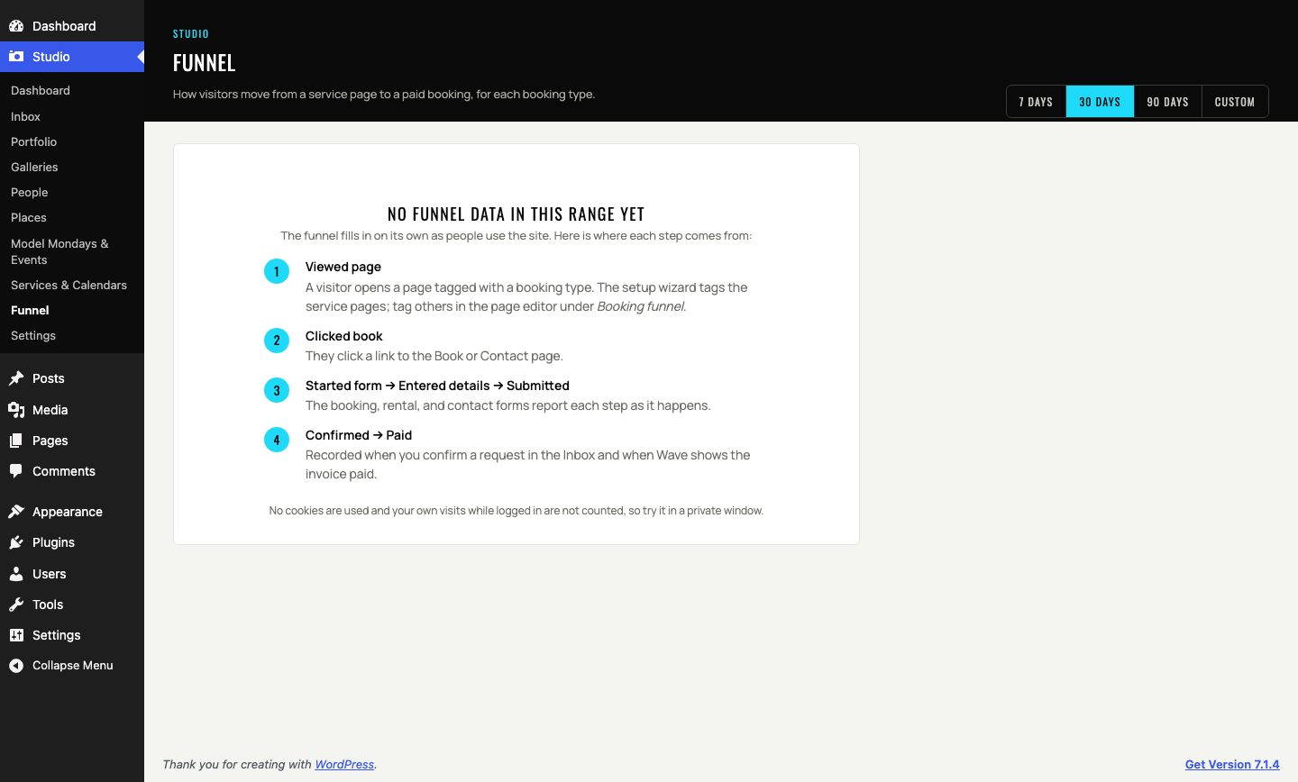
The Funnel page
  1. Every step a visitor takes toward booking: viewing a page, clicking book, starting the booking form, entering their details, and submitting.

  2. Then confirmed or paid, broken out by booking type. And it does all of this without cookies so Shane can know his real conversion funnel stats.

What Shane can do now

Just like before, Shane can build and edit his own pages... but without all of the overhead so he can focus on the content and artistry. When a new Studio Edition opens or a workshop gets announced, he adds it himself from the same blocks the rest of the site uses. If he's running a new promotion and needs a quick landing page, he can do it in minutes.

He doesn’t have to pick a blue, check how it looks on a phone, or wonder whether a screen reader can follow along... those choices were made for him, in the blocks we created for him, so he can get back to the part he loves.

An editor experience that keeps you focused on the content, not the coding

Creativity thrives with constraints, and web pages are no great exception to this. By providing the constraints and framework, we're able to give Shane Baker Studios a clean and clear canvas to build their art on. Shane was absolutely speechless when we showed him how easily he could showcase his art on his new site.

Here's a few examples of what that experience is like for him.

Creating a new landing page is streamlined

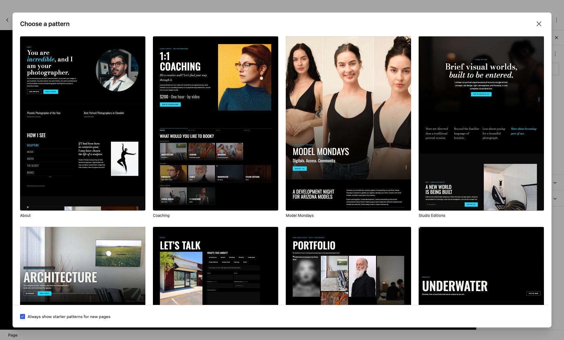
The New page dialog showing premade page templates
  1. Shane clicks New page and gets a set of premade templates to start from. Every template is built from the same blocks, so nothing is a one-off... and he can still edit and rearrange it to his preference. It's just a starting point to get the creative juices flowing.

Fully editable and customizable page templates

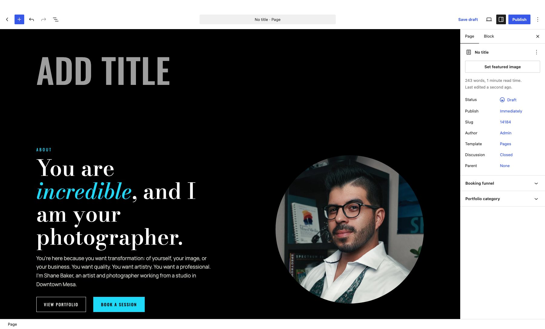
The editor right after picking a template, showing editable blocks
  1. After he picks the page template closest to what he needs, it opens as a page of editable and customizable blocks.

Page blocks focus on experience, not on configuration

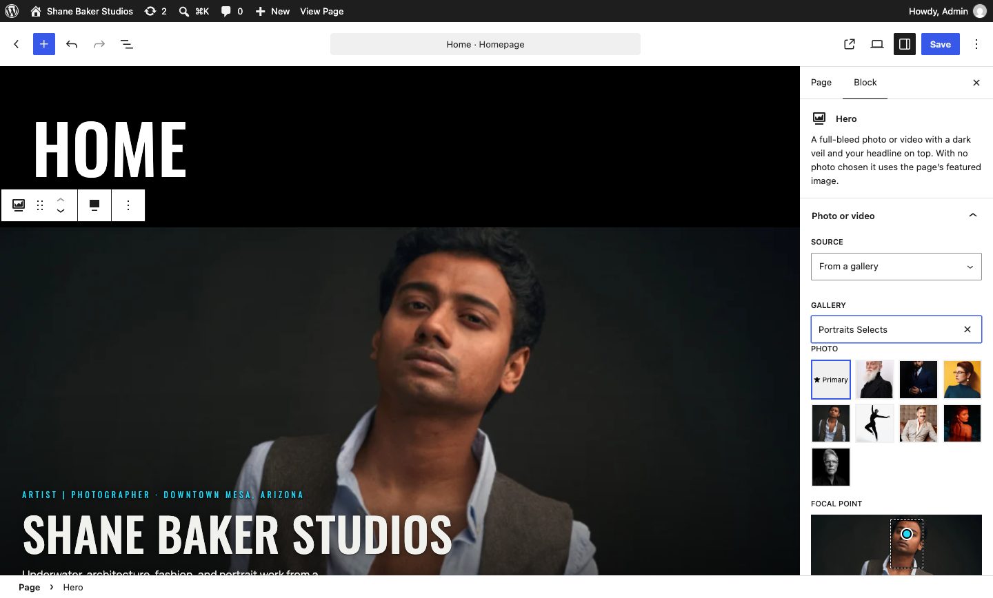
The block editor with a Hero block selected and its options in the sidebar
  1. He clicks a block and sees a short list of named options focused on user experiences, not a wall of settings that could lead to visual brand drift over time. (Or distract him away from his creative process!)

His choices, and the ones already made

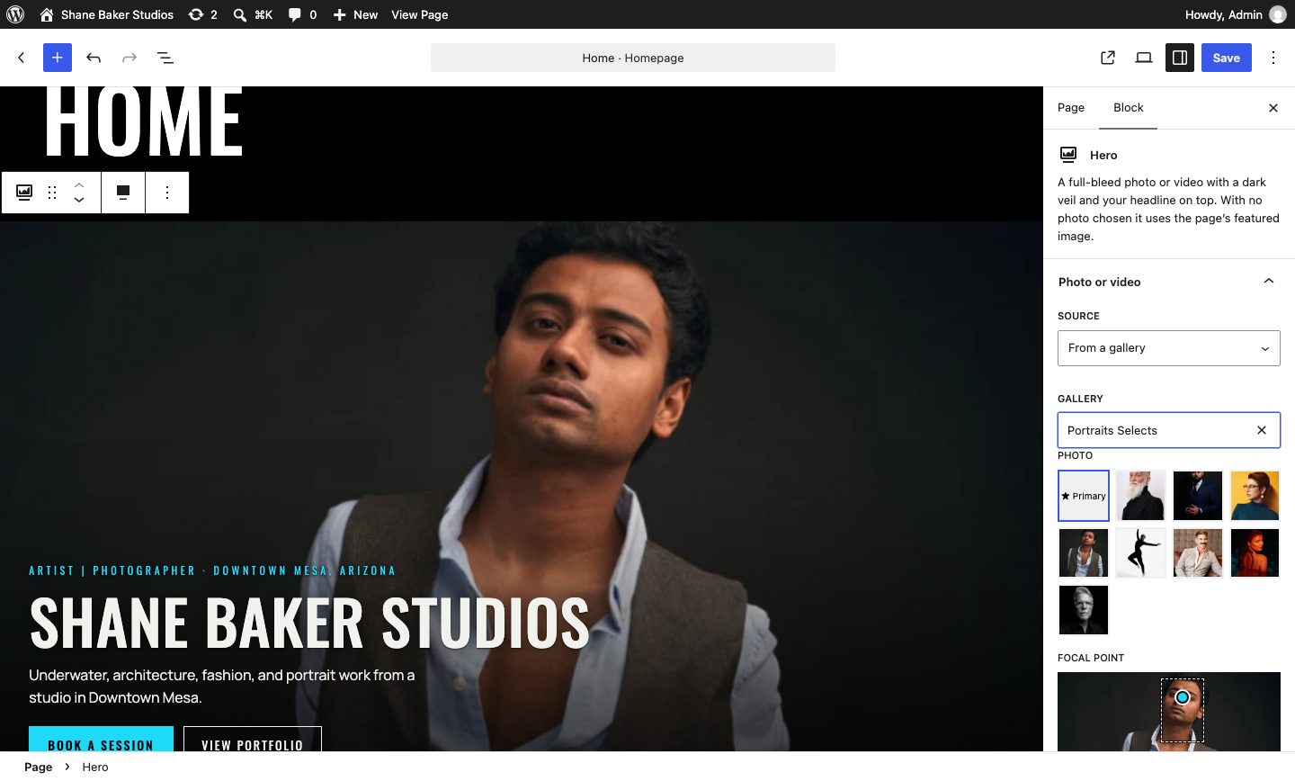
The Hero block settings: a photo source, a gallery picker with Portraits Selects chosen, the gallery photos to pick from, and a focal point
  1. Shane picks from named presets like tall or medium. The brand’s choices were made once, in the blocks, so every page still looks like Shane Baker Studios.

Customizing pages is simple because every element's in the block library

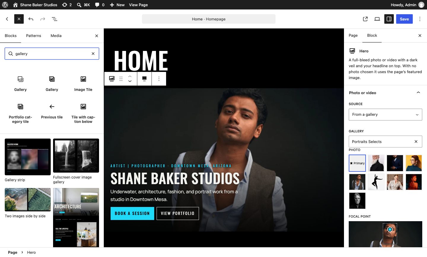
The block inserter listing the available blocks
  1. Need something new on the page? He adds a block from the inserter.

I've built my own sites over the years, and I'd call myself proficient in WordPress, plugins, and SEO. But I've been in my industry so long that I needed someone from outside it to take a look.

Malak did a complete redesign, and when she showed me the beta version I was floored. It was perfect. It fit my branding and honored the client journey.

Days after launch, WP Engine let me know every performance metric on my site was green across the board.

If you're reading this, give her a call and invite her to review your website.

You might find yourself with something better than you could have imagined.

Shane Baker
Shane Baker Studios

I invite you to share your own art with me & the team

Malak Janus, Founder and Principal Developer

My art is thoughtful tooling and well-crafted web sites, and I can't wait to see what kind of art (or "art"! 😉) you build in your field. We can either review your website together, or if you already know what isn't working we can start there so I can give you some immediate targeted and specific advice on how to make it better. Either way, I promise I'll get back to you within a business day.

To do1

What's closest? Pick any.

Done2

  • Read how Magnolia turned around a local studio's website
  • Identify a need in your organization

Has your site grown one page at a time?

We'd love to help you take stock of what's there and build a structure you can keep adding to... without starting over.